
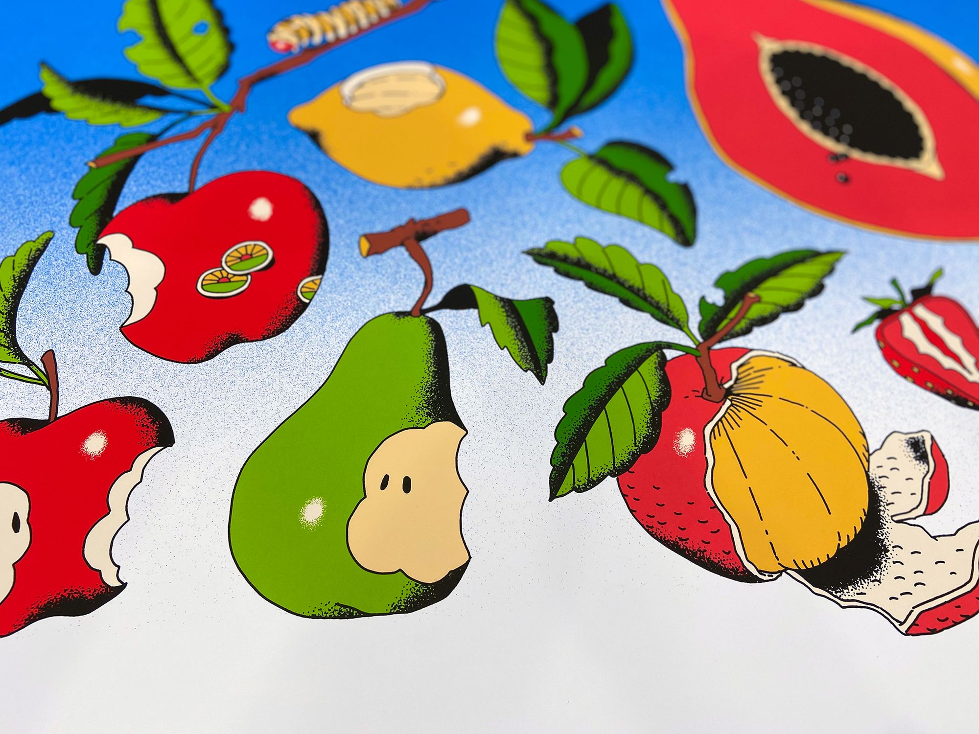
Fruit Bowl by Choo is beautiful and bright, and a great reason to talk about ink mixing.
Black Dragon Press has again teamed up with Melbourne artist Choo, this time to release an art print that is full to the brim with bold colour and immediate appeal. With a print where colour is key, we thought it a fine opportunity to talk you through what it takes to mix those punchy colours.
It was around this time, two years ago, that we worked with Black Dragon Press to print a delightful little artwork by Choo. It was called Propagation, and it depicted a series of exquisite plants — petals, stems, roots, and all — in subtle shades of purple and magenta, each set against a background of black paper.
The gallery’s second collaboration with the Melbourne artist is again a study of flora, but this time with an altogether different approach. Choo’s new art print has the title Fruit Bowl, and it’s poppy artwork finds inspiration in (to quote the gallery), ‘. . . Chinese snack packaging, 1850’s French surreal animation Forbidden Planet, and that post that says “see you in hell you stupid fruit”’
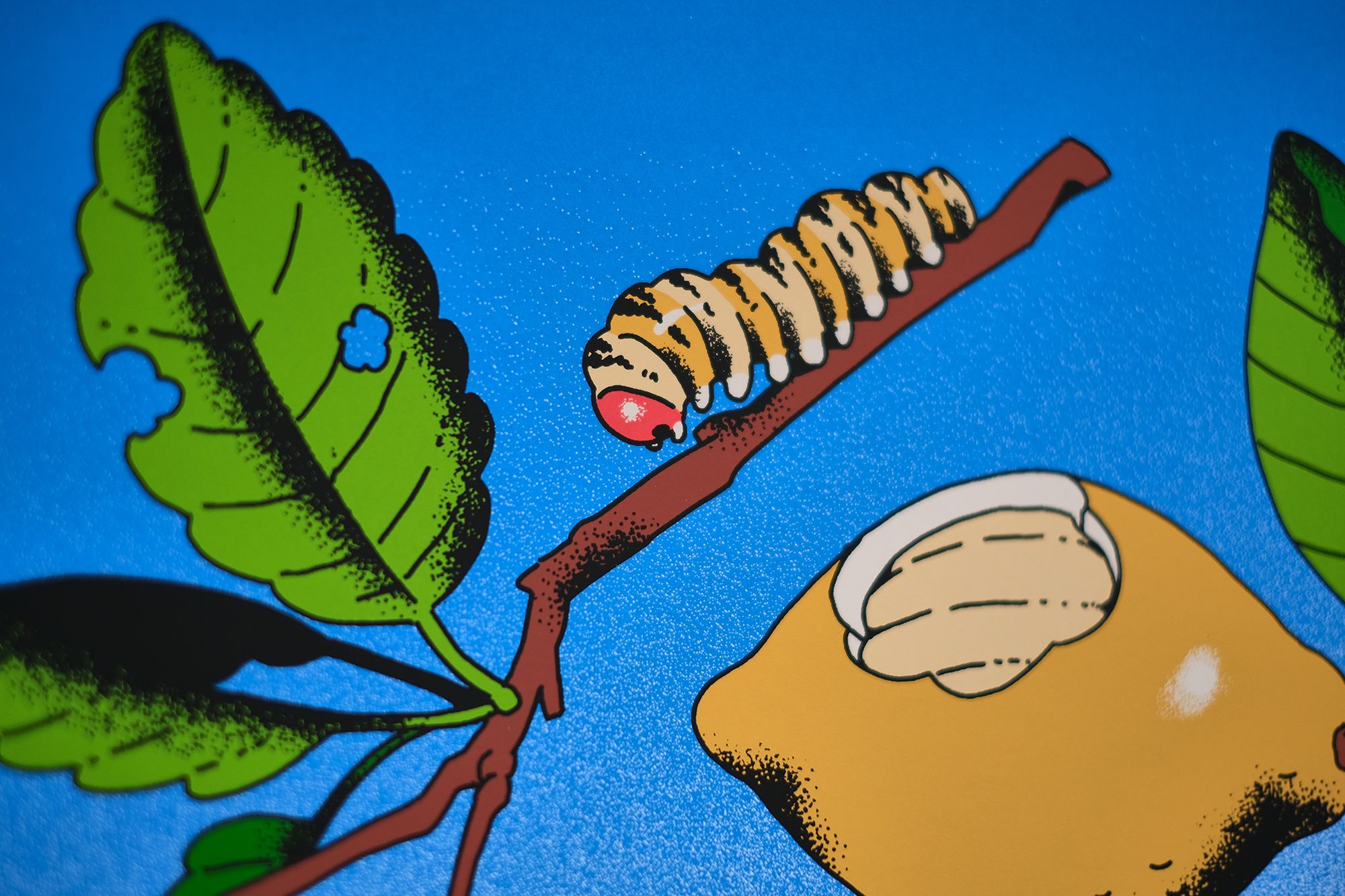
It’s a peach of a screenprint (pun intended). 10 inks. A tactile sense of layering. And the bright, saturated colour palette is like a welcoming doff of the hat, worn by an old friend. It somehow taps a groundswell of nostalgia, yet is vivid and fresh enough to also feel brand new.
For us, turning Choo’s fantastic artwork into a screenprint was all about the colour matching — a key process that arguably breathes life (or death) into the final print. As it’s such an important part of the process for us, we thought it might be of interest to you, to give some insight into how we go about matching colours for print.
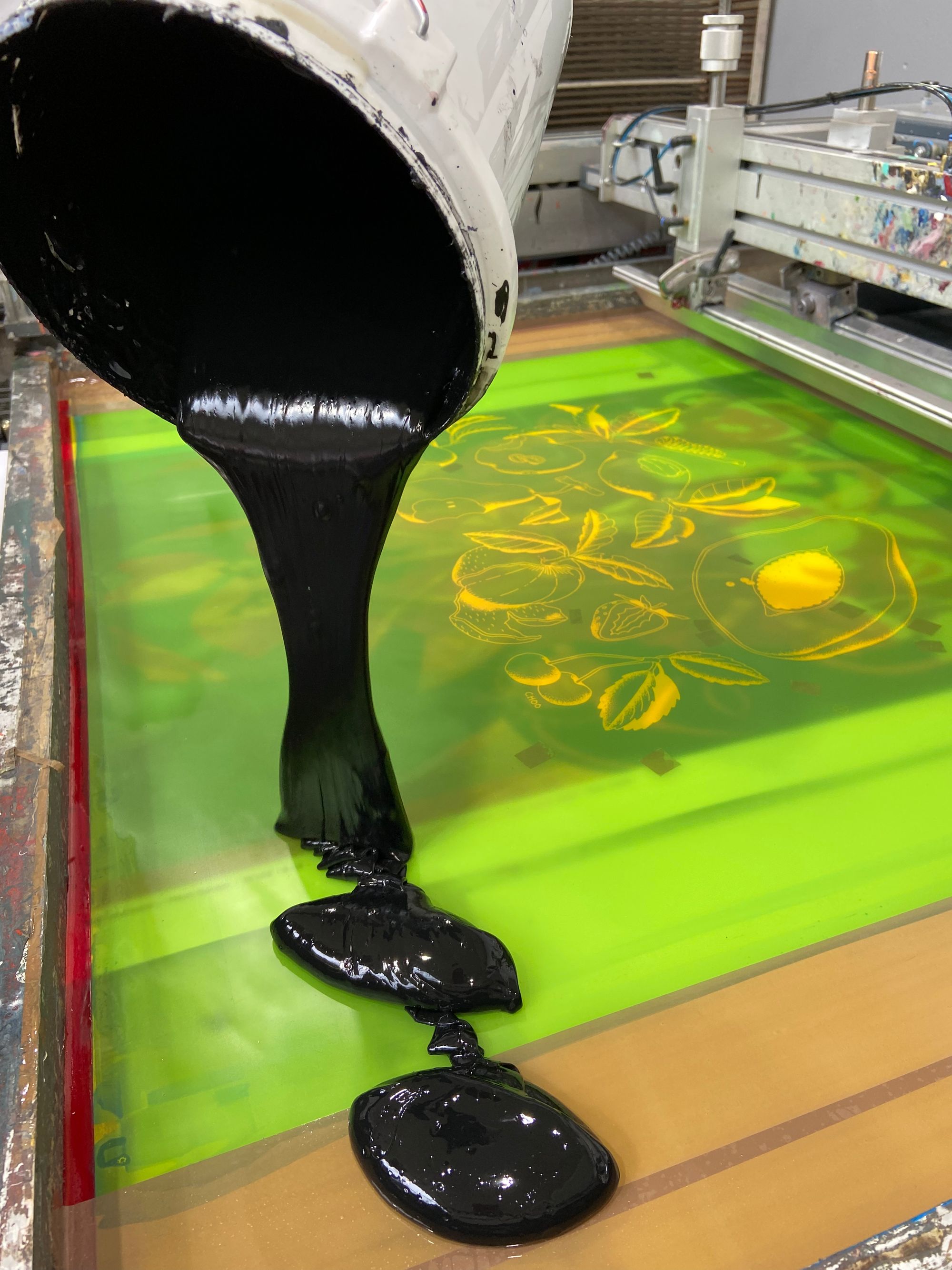
When it comes to mixing the inks for a screenprint, it’s worth bearing in mind that every colour palette is unique. We mix all inks by eye, and some colour palettes are more challenging than others. Some are a real pain in the backside to fine tune. Some (I hate to say it) are just a little dull. But then there are some that are just plain fun to work on!
The colour palette for Choo’s Fruit Bowl was undeniably of this latter variety.
One area in which screenprint holds an advantage over digital, is in its ability to pull off virtually any colour it is challenged to recreate. Printing directly onto bright white paper, and given a few other key conditions, there really is no limit to what colour value can be achieved. The trick is in matching the inks accurately to the colours intended by the artist (and also, in an ideal world, it's in elevating them!), and this process can easily be muddied by the filter of a computer screen.
What do I mean by the filter of a computer screen?
Well, everyone’s computer screen has the potential to show a different version of the artwork, in terms of colour values, and everyone’s lighting has the potential to skew that representation further. At White Duck Editions, our monitors and studio lighting are calibrated and set up to ensure accuracy in how a digital artwork is viewed, but there is no guarantee that those conditions are shared elsewhere, which makes discussing how an artwork looks on a computer monitor something of a misguidance.
In short, it’s to be avoided.
Ultimately, there is nothing quite like a physical object to work from. A red sock, after all, is always going to be easier to match an ink to than a red square on a computer screen (there’s some advice here, hidden in plain sight — it is: if you have a sock that is the perfect red for your print, don’t send us a photograph of the sock, send us the sock). This is why we often produce a digitally printed proof — a physical print — which bridges the gap between computer screen and screenprint edition.
We employed this process for Choo’s new art print, as it certainly does guarantee another level of accuracy. And yet, this part of our working practice is still flawed, because some colours simply refuse to represent themselves accurately when digitally printed. We tend to refer to this as out of gamut, meaning any colour that cannot be reproduced with ink (in this case, the very broad — yet still limited — range of inks in our Canon printer). It’s a bit of a techy term. It’s also a bit of a frustrating reality.
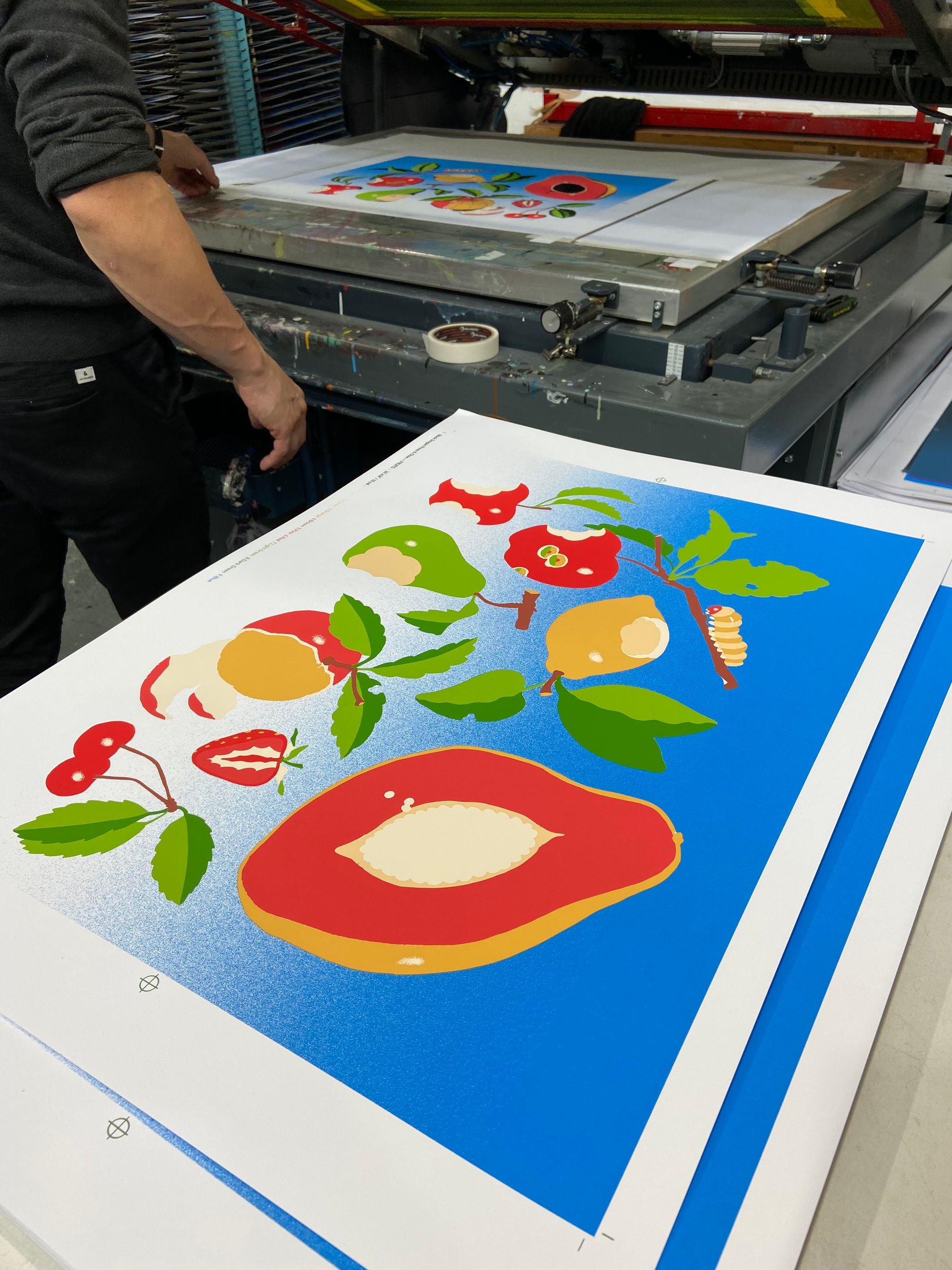
However, at this stage we can identify any colours that are affected in this way, and we can make a note to elevate the screenprint inks beyond what was possible with the digital proof. With Choo’s Fruit Bowl, it was the blue that our digital proof couldn’t quite achieve, but we were able to quite easily formulate a screenprint ink that hit the right note. A zinging note, at that, hanging at least one octave above its digital counterpart.
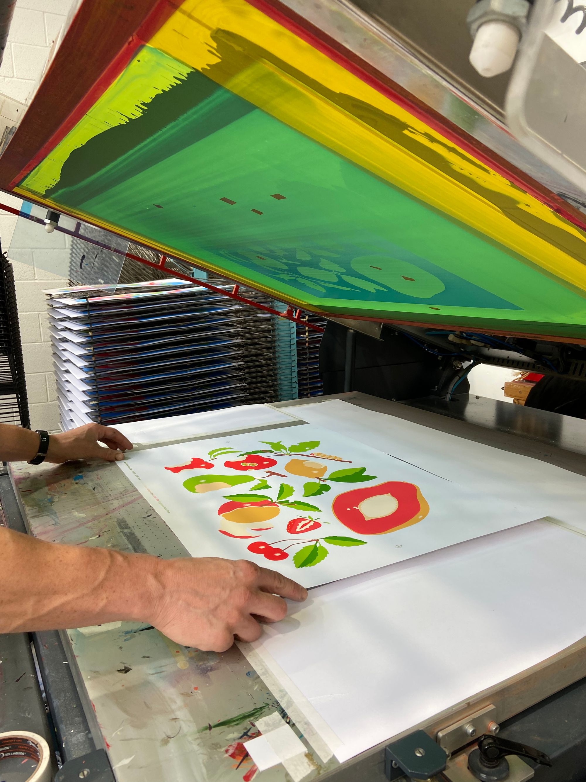
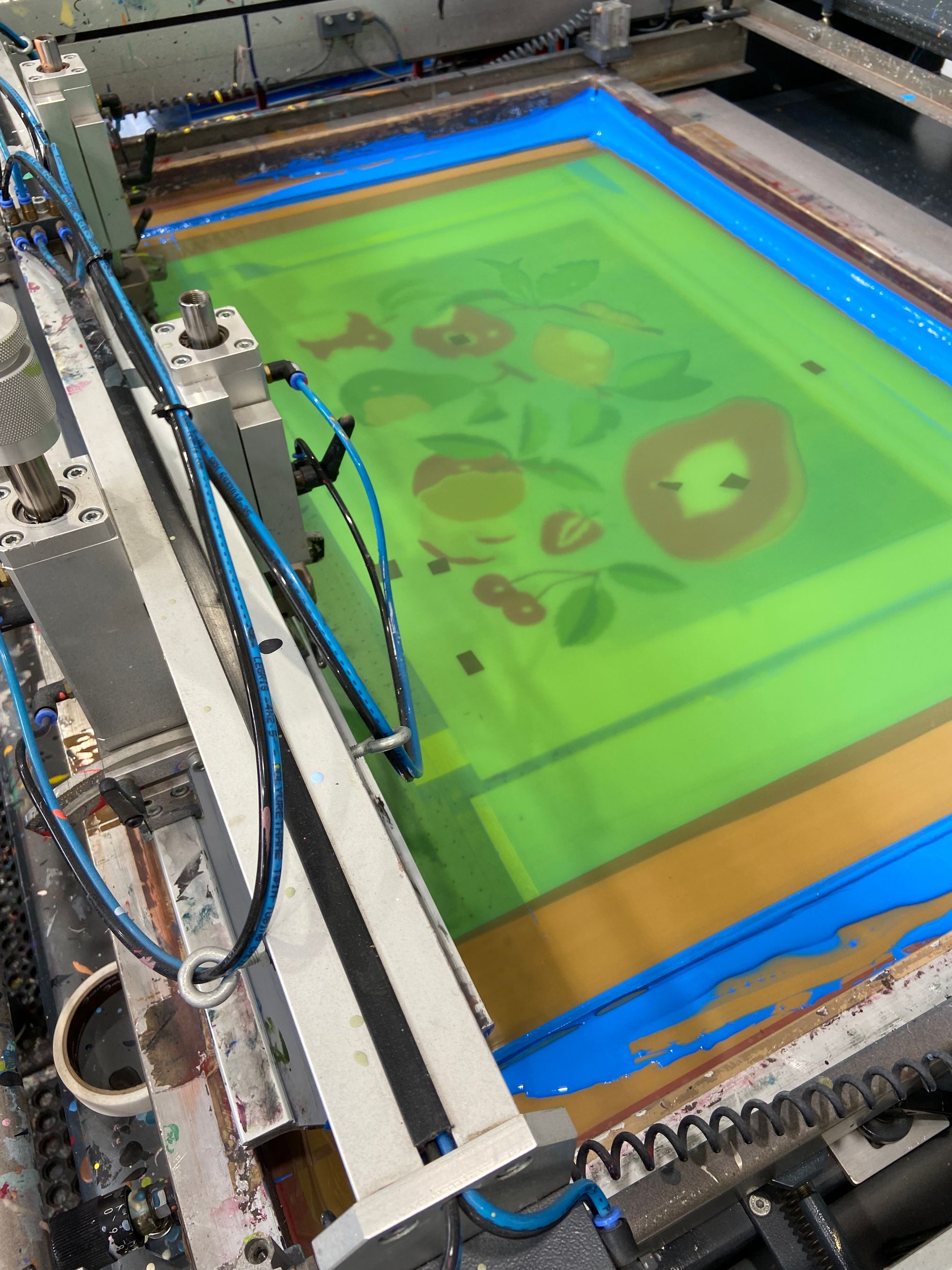
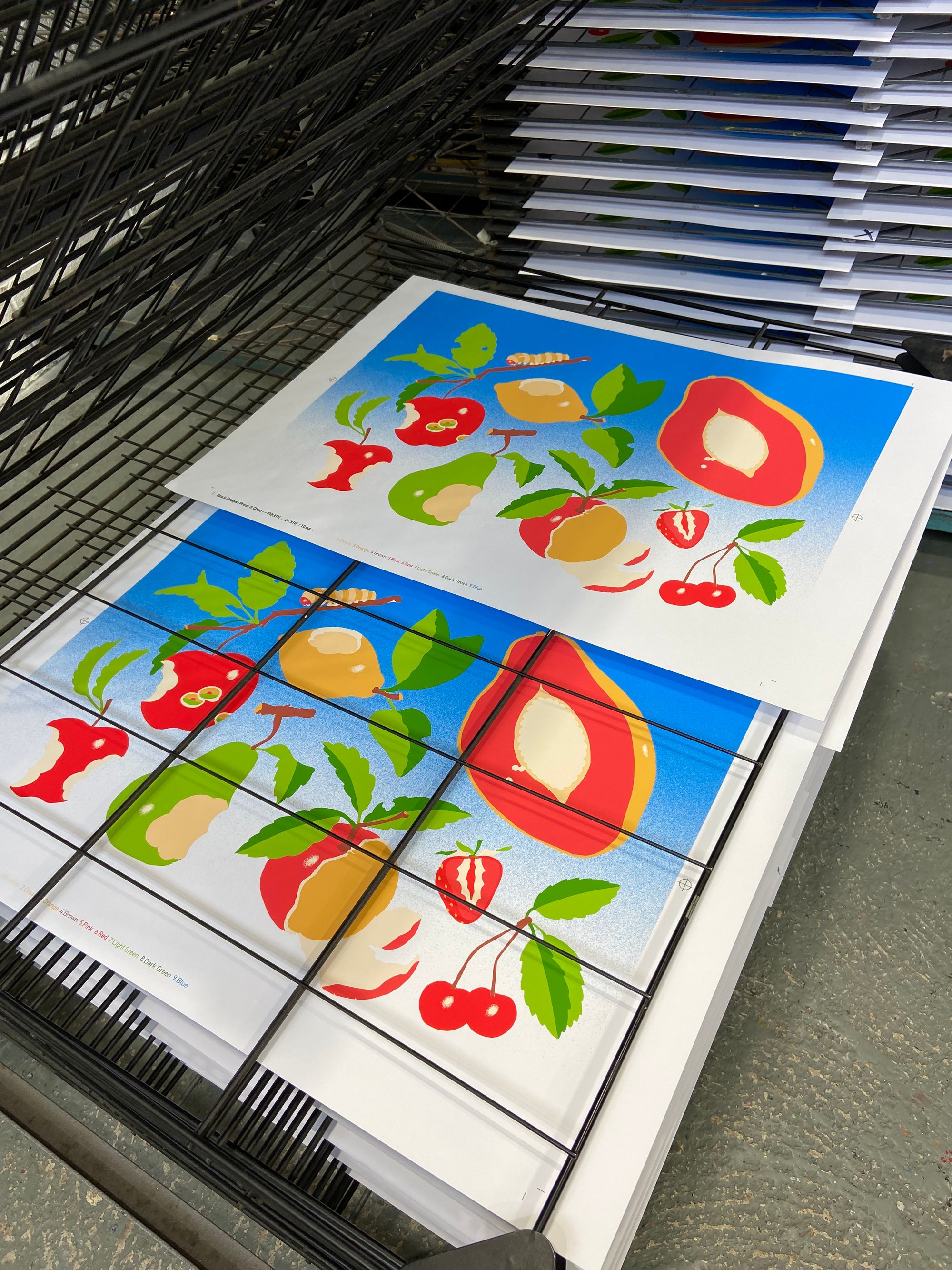
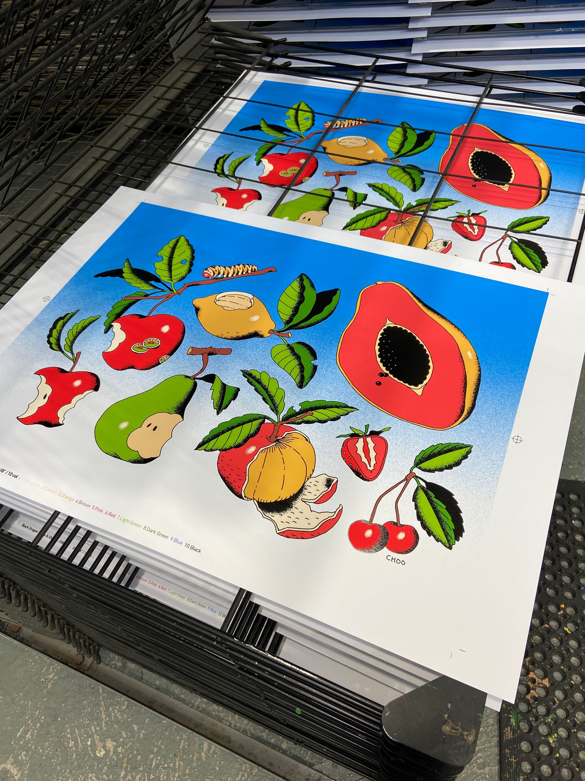
Here’s an image to illustrate the point. The top is our digital printers proof, complete with a set of digitally printed colour swatches. As mentioned earlier, the artwork is spot-colour, with 10 colours in total. Below the digital proof is the first completed screenprint, fresh off the press, along with the screenprinted ink swatches that were matched to the digital proof.
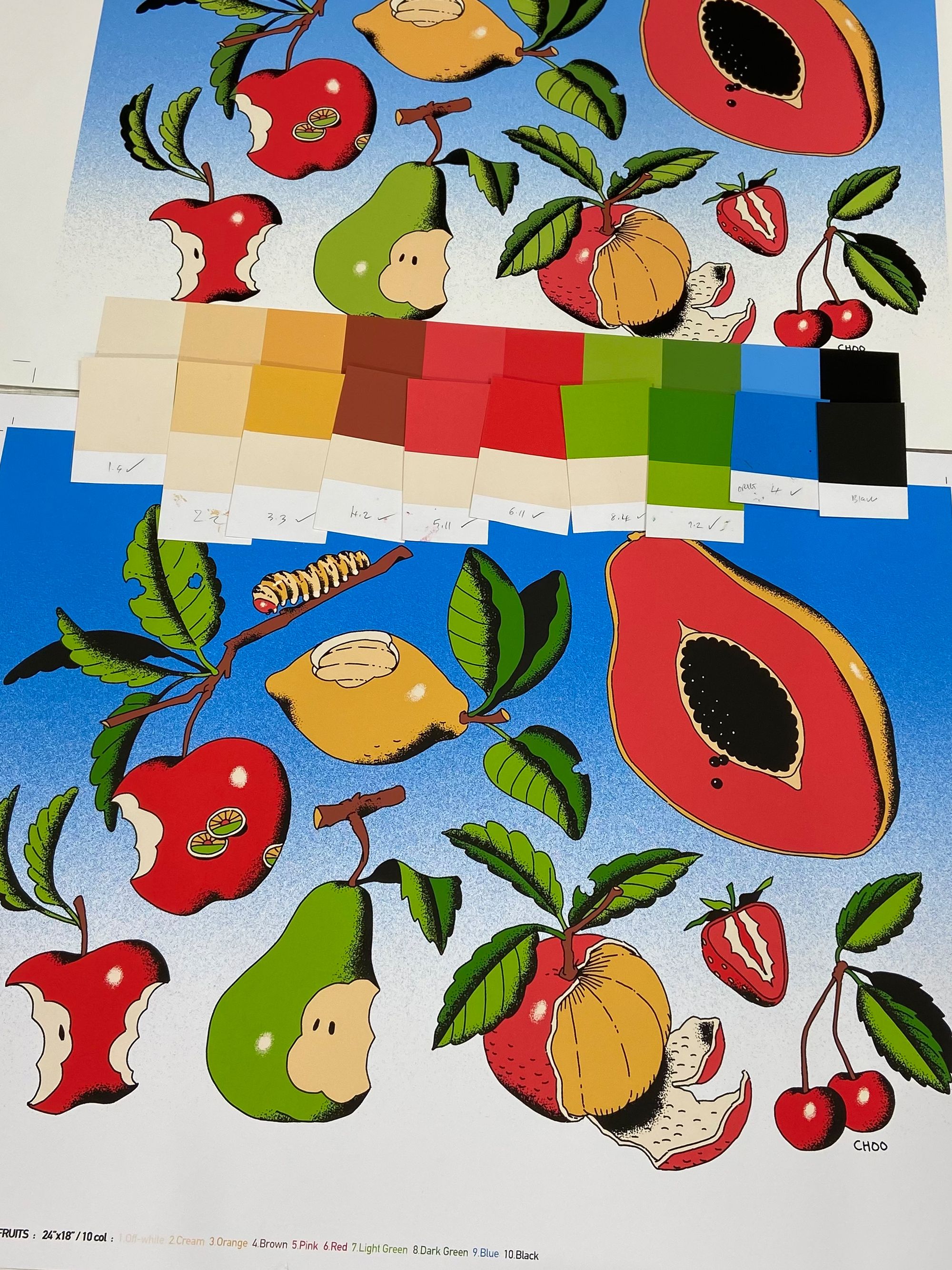
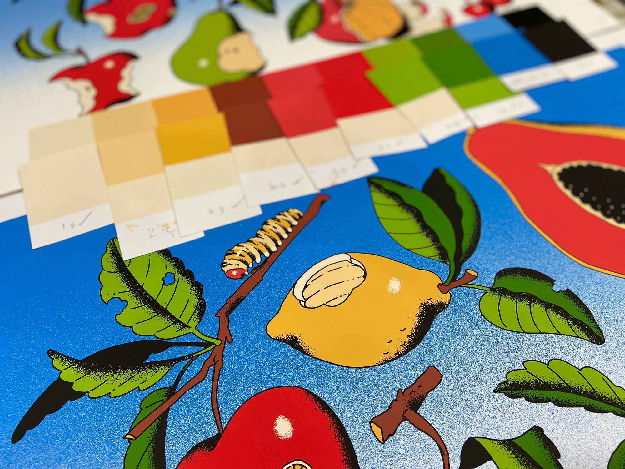
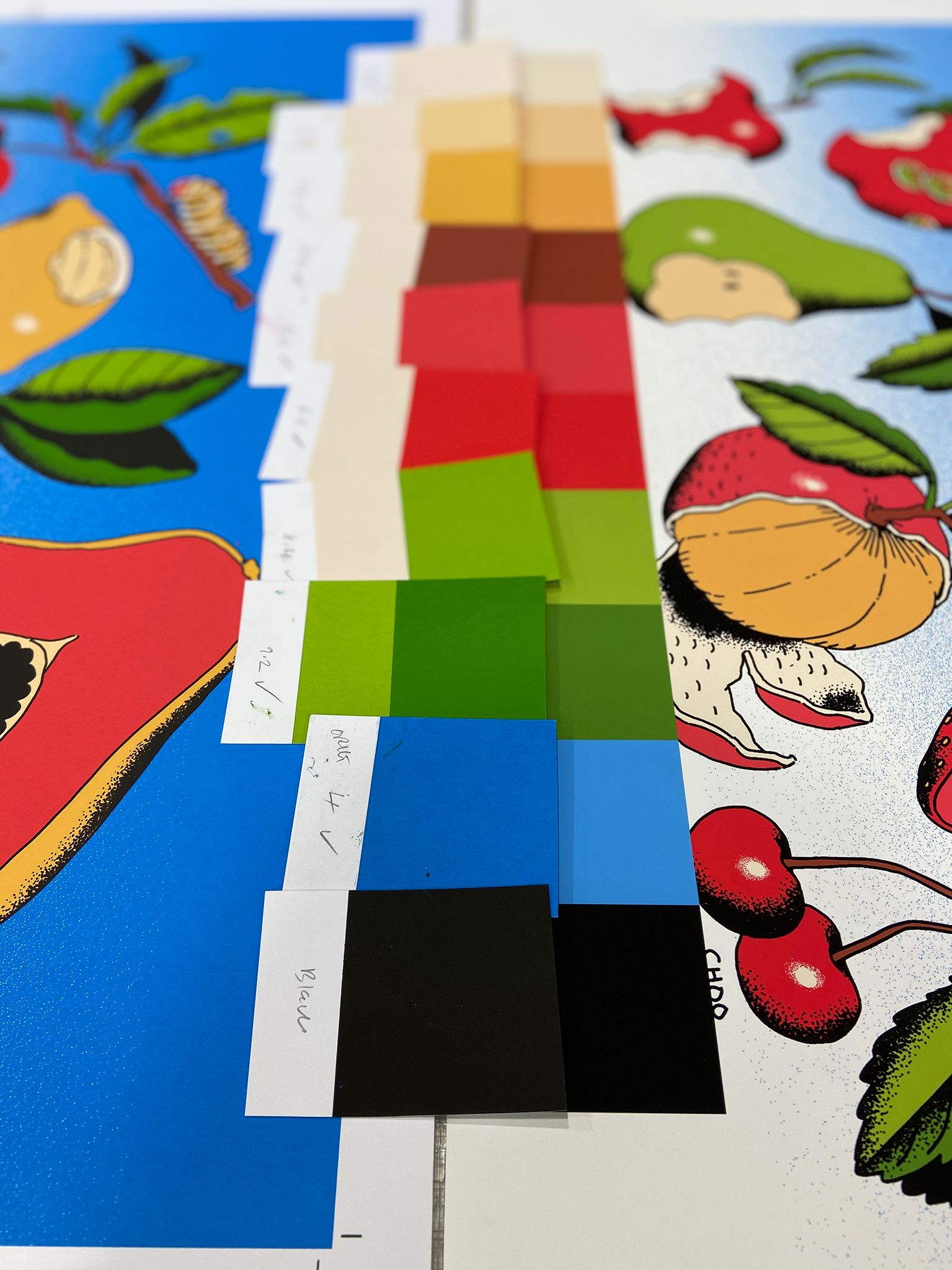
If you look carefully, you can see some variation in the colours between our digital proof and that first screenprint. The blue is the most noticeable, but we were also able to add a lug of zing to a few of the other colours. This was mainly achieved by adding small volumes of fluorescent pigment — especially noticeable in the red — but also by carefully balancing the ratio of pigment and transparent/opaque base.
The result is a 10 colour screenprint which, in so many ways, exceeds what was possible with the digital process. The screenprint is bolder and brighter, and close up it has a tangible depth and weight to it, where the layers of ink can be seen stacked upon one another. Their unique interaction with the paper, and with one another, is just one of the virtues that make the screenprint medium and this style of artwork a perfect pairing.
So there you have it — a little behind-the-scenes of how we go about the work of matching those print colours, and how with screenprint the opportunity is always there to improve upon the expectations of what a print can deliver.
All these small processes add together to create something palpable and visibly full of labour. Something that we hope pops open the eyes of the collector, when they excitedly unroll the print from the tube.
Fruit Bowl is available NOW from Black Dragon Press. And as a little thank you for reading all the way to the end, we are able give you a special offer on this superb art edition. The first 10 customers who buy a print using the promo code WHITEDUCK20, will get 20% off their purchase. How about that?
Choo’s Fruit Bowl was screenprinted at the White Duck Editions studio in a limited edition of 100 + AP’s, in 10 beautiful spot-colours onto 300gsm Gmund Bauhaus paper.

