
Is blue the deepest colour? Moonlight by Malika Favre.
In her new screenprint edition, Malika Favre’s colour palette delivers a trenchant exposé of the Barry Jenkins film. Yet in the blue alone, there is even more to find.
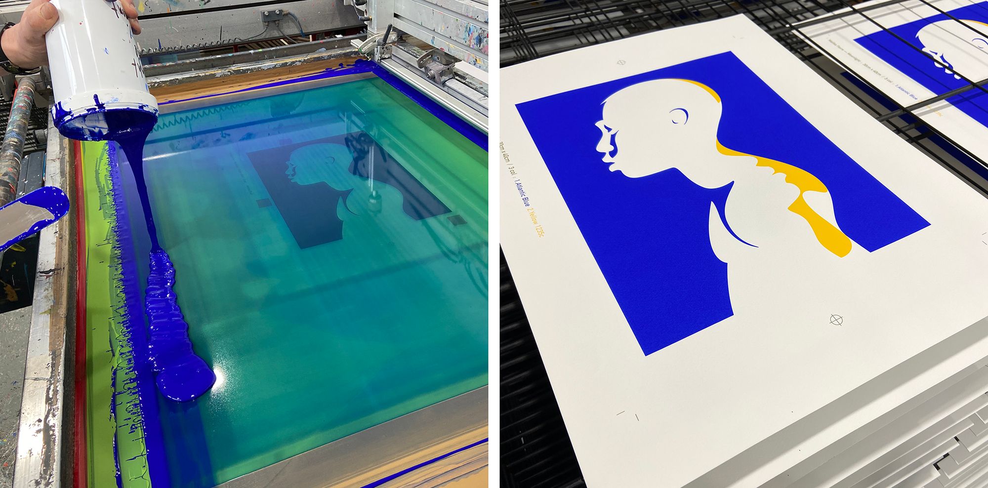
Moonlight is a new screenprint edition by Malika Favre, depicting a stirring homage to the Barry Jenkins film of the same name.
Malika’s signature illustration style and use of colour plumbs depths that the film reveals slowly, steadily and beautifully, over its almost two hour run-time. While it seems certain that the illustration is based on the final scene from the film, where young Little is seen standing on the beach, framed by the ocean, turning to camera, it is primarily the composition of colour within the work that speaks the loudest about the symbolic use of colour within the film. Though the clear silhouette is recognisable as Little, the use of black perhaps represents his older third-act self; the yellow, hesitation and poised self determination; and the blue, the omnipresent undercurrent, the calm ocean surface, both the hope of arrival and the eventual destination.
Of course, Malika has an uncommonly focused eye when it comes to coercing another level of brilliance out of already radiant colours, and there is a deftness and acuity of intention in the use of colour in her Moonlight artwork. While on one hand it riffs cleverly on the subtle fabric of the film, on the other it plays strongly to the artist’s love of this one particular blue. A vibrant, saturated, alive and penetrating, blue. A blue that is full of warmth and promise. A vivid experience of blue, that dares the viewer to take only a glance, knowing full well that to glance is to stare, and to stare is to become absorbed and altogether lost.
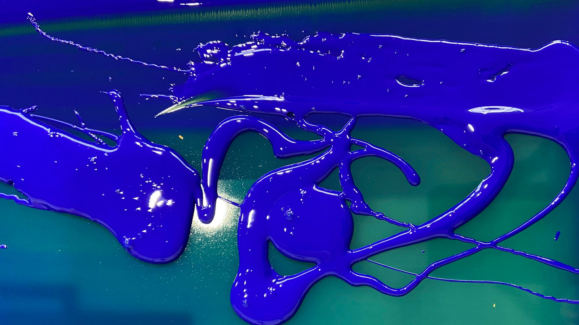
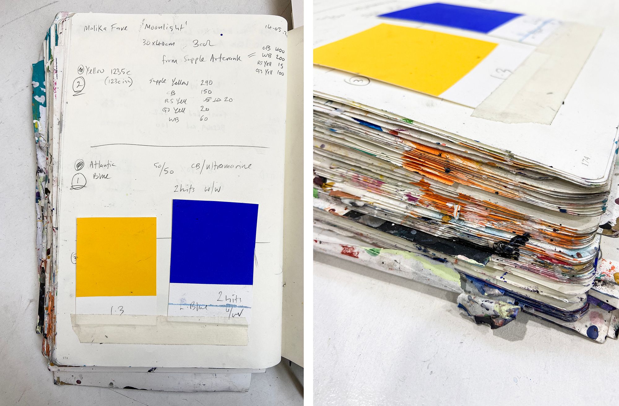
Some colours capture the imagination. They fascinate us and occupy our thoughts, and have the power to guide our actions. To say that all blue has this affect is perhaps to generalise, but one such blue hue, that for the last 60 years has spoken to the minds of many and guided with an indelible voice, is Yves Klein’s blue (or International Klein Blue). Many a long and thorough blog post could be written about this one blue, but for this post it is a great reference point for Malika’s work, and essentially it is Yves Klein’s dense vibrancy of blue that we have been striving to achieve when creating screen prints for this artist. By no means a straight forward task, but an objective that draws closer to a conclusion with each iteration.
The work on Moonlight led us — perhaps unsurprisingly, given the original composition of International Klein Blue — to creating an ink mix that is heavily reliant on ultramarine pigment. This pigment is suspended in a clear base, giving a translucent ink which, when layered onto bright white paper, allows a high transmission and reflection of light, in and back out of the ink film. This interaction between paper, pigment and light, gives the blue a multi-dimensional, objective quality, not to mention an undeniable warmth. The warmth, perhaps, is found in the depths. It’s hard to glean such a physical sensation from a colour that has a flat and unyielding surface, one which leaves the viewer as entirely external, where the three key layers of interaction are rendered separate: the paper, which is hidden, the ink, which is opaque, and the viewer, who is other. Printers and painters alike, who are reading this, will be all too familiar with the effect that opacity has on their ink or paint. To add white to an ink mix is akin to closing the aperture on a camera: a flattening occurs upon the surface of the subject, a broadening out and a loss of something intimate. Similarly, the opposite of this is true: layers of translucency deliver depth, interaction, and an engagement with the viewer that filters out all periphery.
In a wonderful spoken excerpt from his book I Send You This Cadmium Red, John Berger reflects on the experience of witnessing Yves Klein’s blue, saying
“Everything else, except the fact of blue, has been eliminated.”
This is a telling description of the enveloping totality of this almost impossibly deep blue. Once one’s eyes are locked upon it—once the aperture is wide open—it is hard to see or experience anything but this blue.
We find the screenprint medium to be perfect for exploring these rarefied sensorial experiments of colour. There is a controlled consistency to the process that allows us to work systematically through a range of shades, to arrive at one colour—or depth of colour—that does just the right thing when printed.
Working with translucency is in many ways more susceptible to minute procedural and studio climate alterations than when we work with opaque colour. Small percentage differences in the pigment to base ratio can radically change the look of the deposited ink film; the thread count of the silkscreen mesh affects the volume of ink transferred to paper, which in turn affects the perceived saturation of the ink; the paper itself has a colouring effect, where a cream paper will add a tinge of green to a translucent blue ink; and press conditions on the day, as well as viscosity of ink, can affect the depth and finish of the colour, heat and low humidity being the drier and thickener of inks in motion. But again, it is this involved interaction with the ink, with the colour itself, that begets a beguiling sense of focus. One becomes willingly lost in the process.
The willingness is notable, when considering the exchange that occurs between the viewer and this particular blue. Without question the exchange is two-way, both proponents wishing to give and to receive. And in this push and pull, the crossing of a great distance is discovered, as if one is walking toward a destination unknown, when the destination is in fact all around, holding us in sway and yet pushing us gently forward. Enveloping and developing, an experience much like life, and much like the extraordinary use of blue in Barry Jenkins’ film, where the colour blue seems to be the hidden hand that guides. Blue is the medium of exchange, where love and the self are found.
To reference John Berger a second time, again from his aforementioned book, he has this brilliant line, which somehow seems perfect for describing blue itself and the use of blue in both Moonlight the film and Malika’s artwork—
“I am yours, or you are mine, and no other can judge us.”
I appreciate that’s a lot of focus on the blue. But what of the yellow? And what about the dazzling interaction between the two? I think we’ll have to save those contemplations for another time.
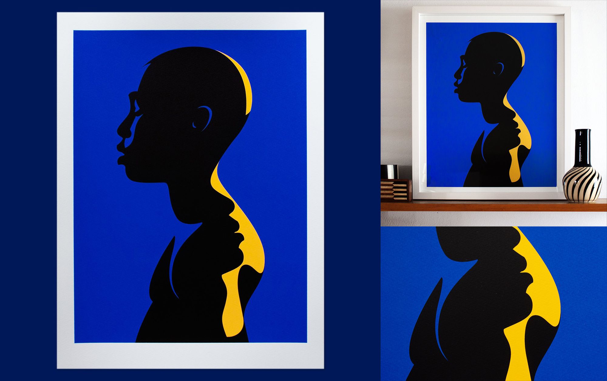
‘Moonlight’ was screenprinted at the White Duck Editions studio in a 30cm x 40cm edition of 100. Blue, yellow and black inks on 310gsm Somerset Tub-sized Satin White paper. Visit Malika’s shop to find out more about this beautiful edition.

