
The Red Shoes, screenprint edition by Laurent Durieux and Dark City Gallery
The renowned Belgian illustrator and long established UK gallery team up to fulfil a near decade long quest: to create the very first officially licensed alt. movie poster for one of Powell & Pressburger's all-time classics.
“You can’t have it both ways. The dancer who relies upon the doubtful comforts of human love, may never be a great dancer. Never!”
As the opposing forces that come to bear upon dancer Victoria Page are only just beginning to gather form, these words are tellingly spoken by Boris Lermontov, while standing backstage and for the ascendent dancer to overhear. The balet company director’s sentiment spells out both the dichotomy that the dancer will soon face, as well as the overarching précis of the film: that great art naturally and necessarily goes hand-in-hand with great personal sacrifice.
Not only was The Red Shoes highly self-aware in its post-war promotion of the arts, but—as Ian Christie writes in his essay for The Criterion Collection—it is “a stunning demonstration of cinema’s claim to have united the traditional arts in a new synthesis.”
Considering the cinematic significance of The Red Shoes—released hesitantly in 1948 by The Rank Organisation—it is surprising that the film has not seen countless poster homages over the years. This is given some perspective when considering that Dark City Gallery have had this poster project in the pipeline for the best part of a decade.
As the gallery explains in their press release for the poster:
“Due to the importance of the film and the number of film patrons needed to approve the artwork, it’s been a challenging project to complete. Thankfully, with (the master of poster design) Laurent Durieux onboard, we were finally given the green light to screenprint the first ever officially licensed alt. poster for this iconic movie gem.”
It is hard to imagine a better artist for the project. At least, with the artwork revealed, the pairing of film and artist feels at once timeless and utterly correct.
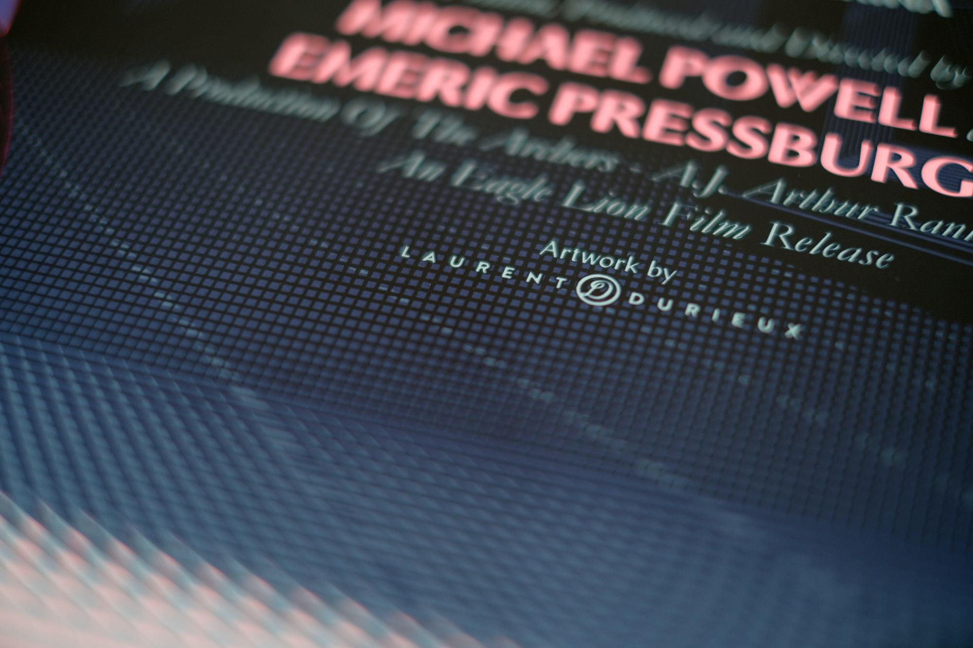

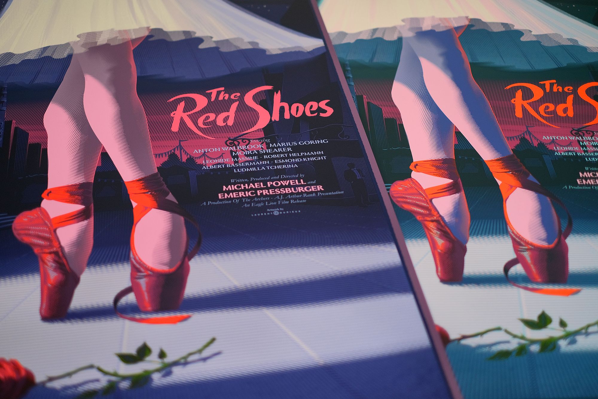
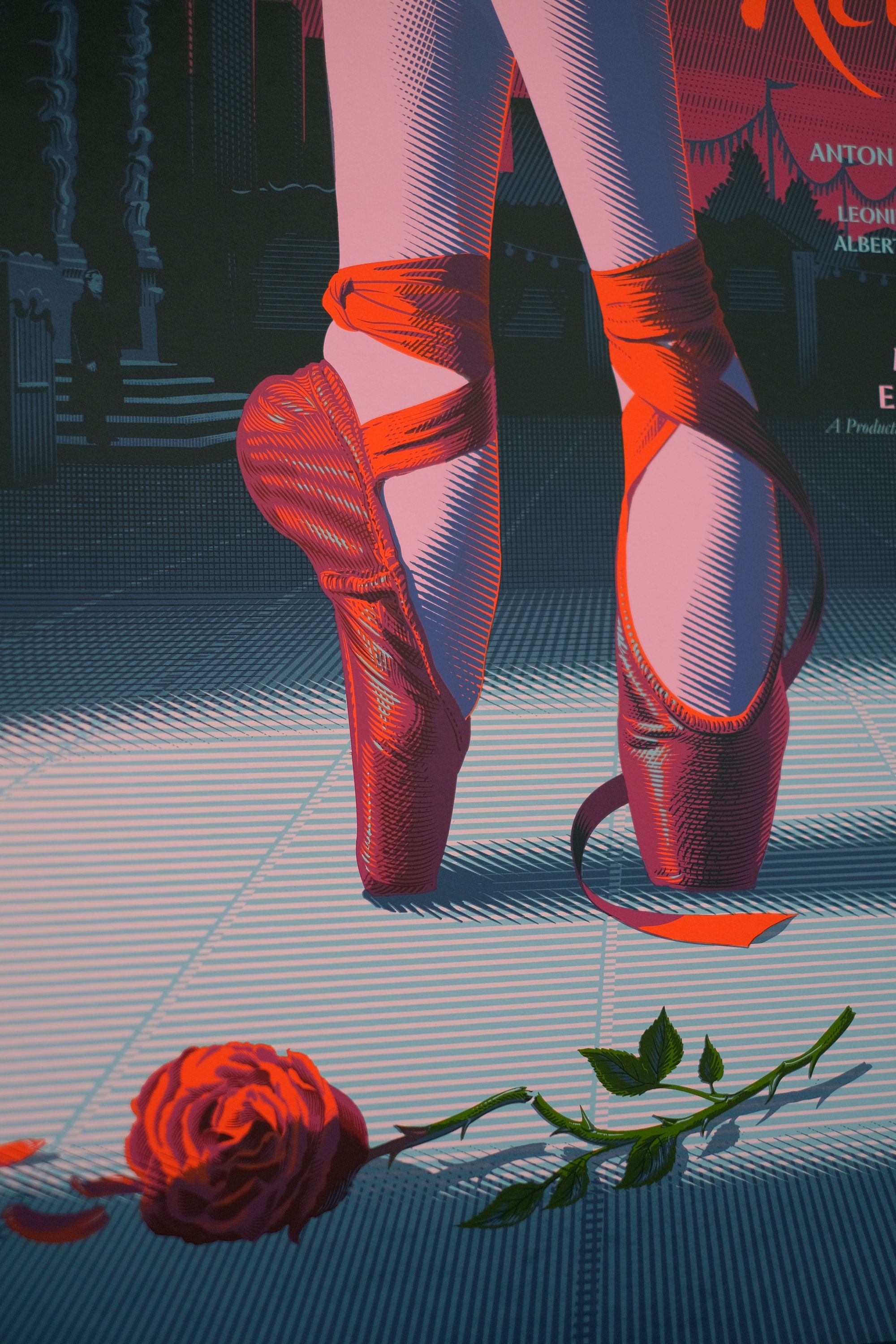
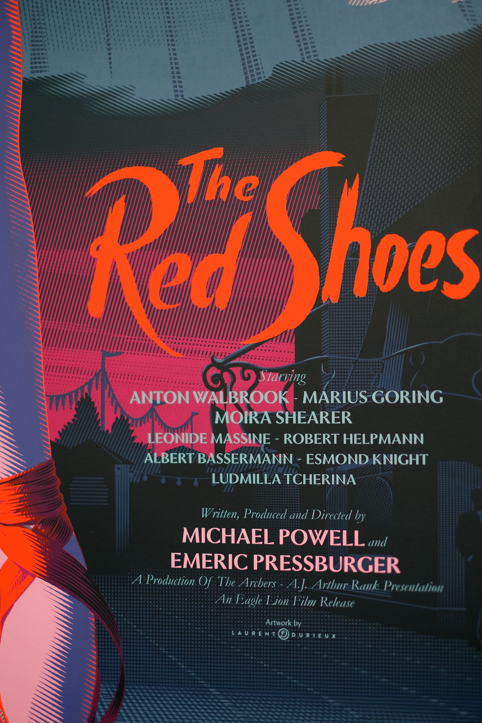
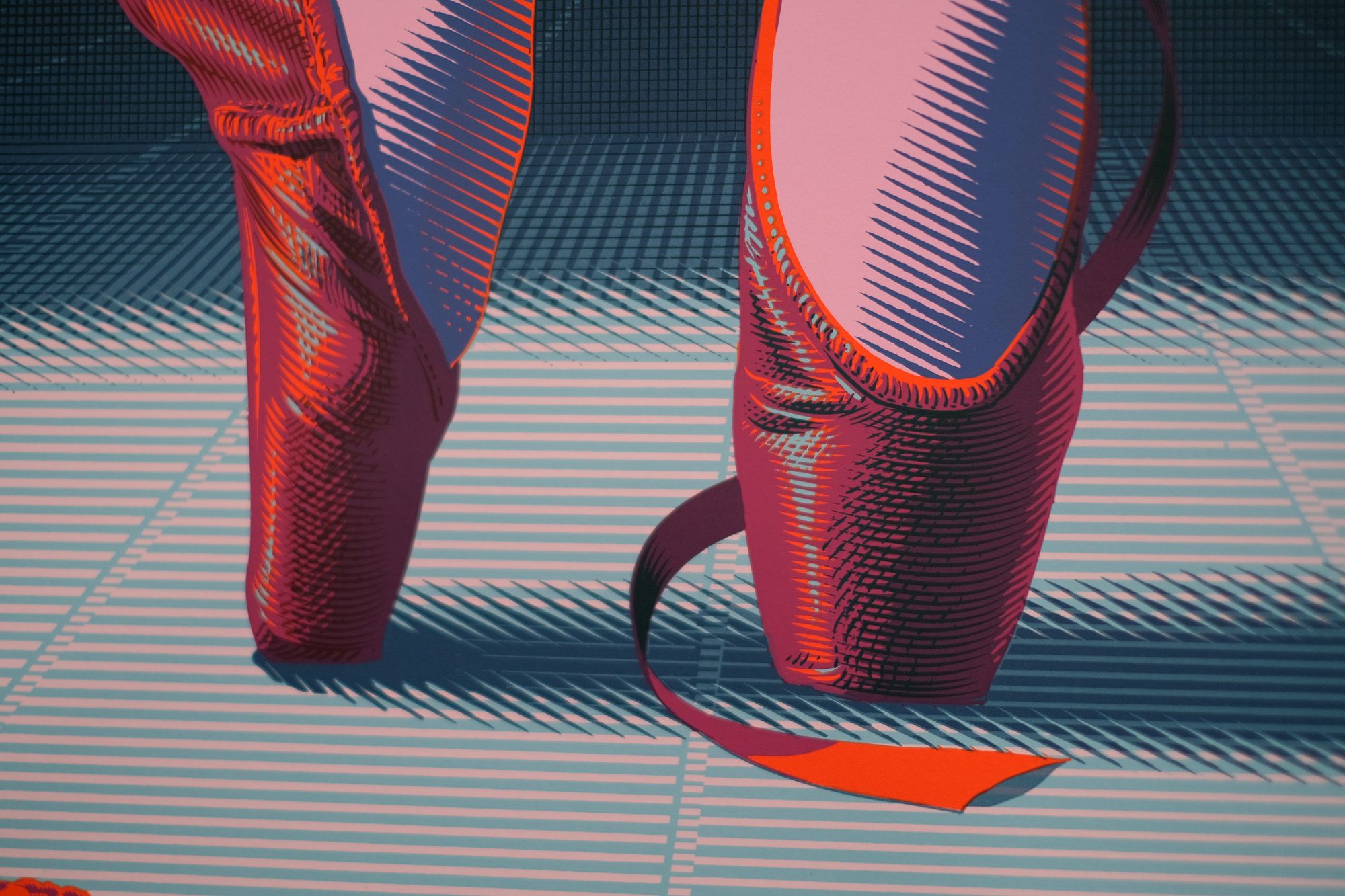
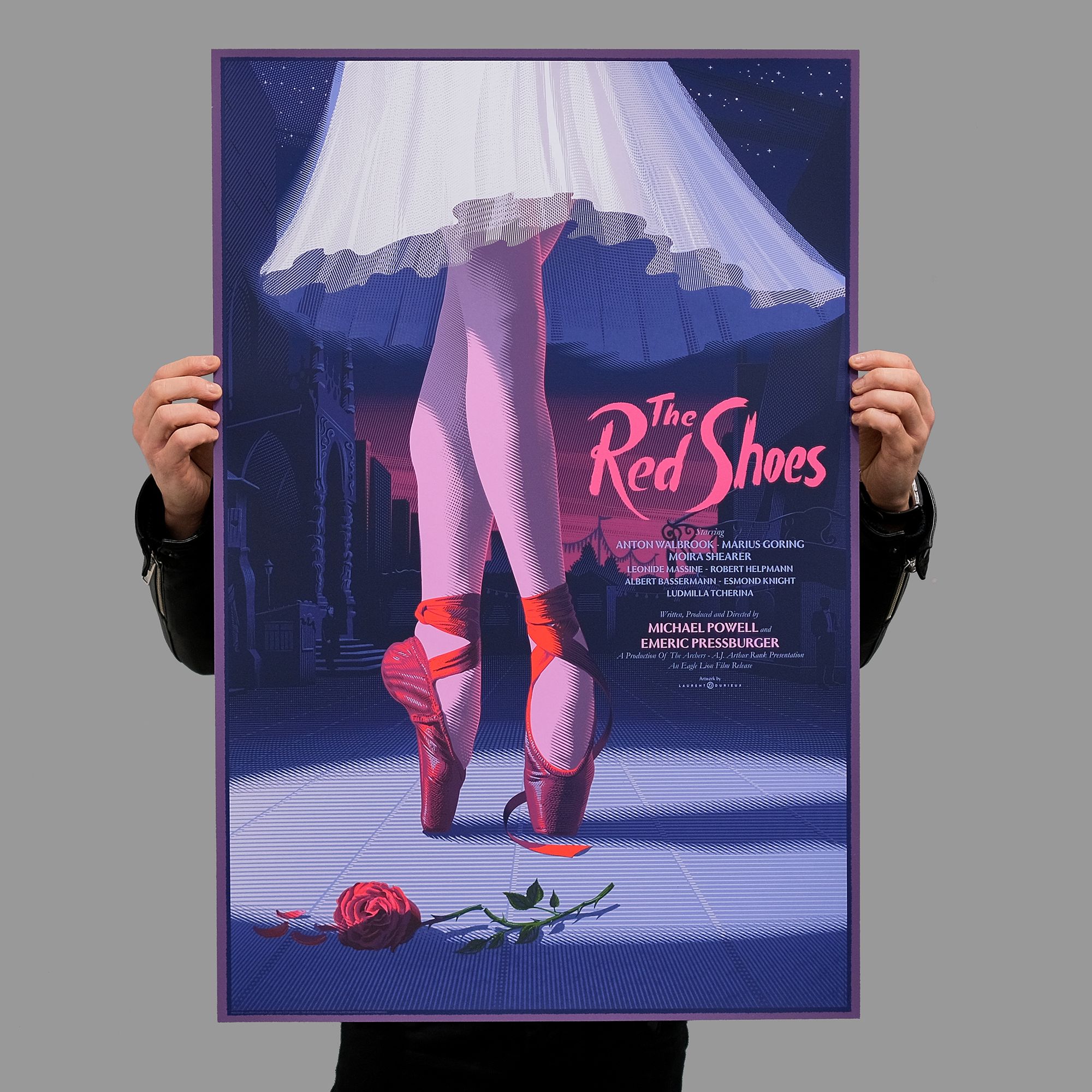
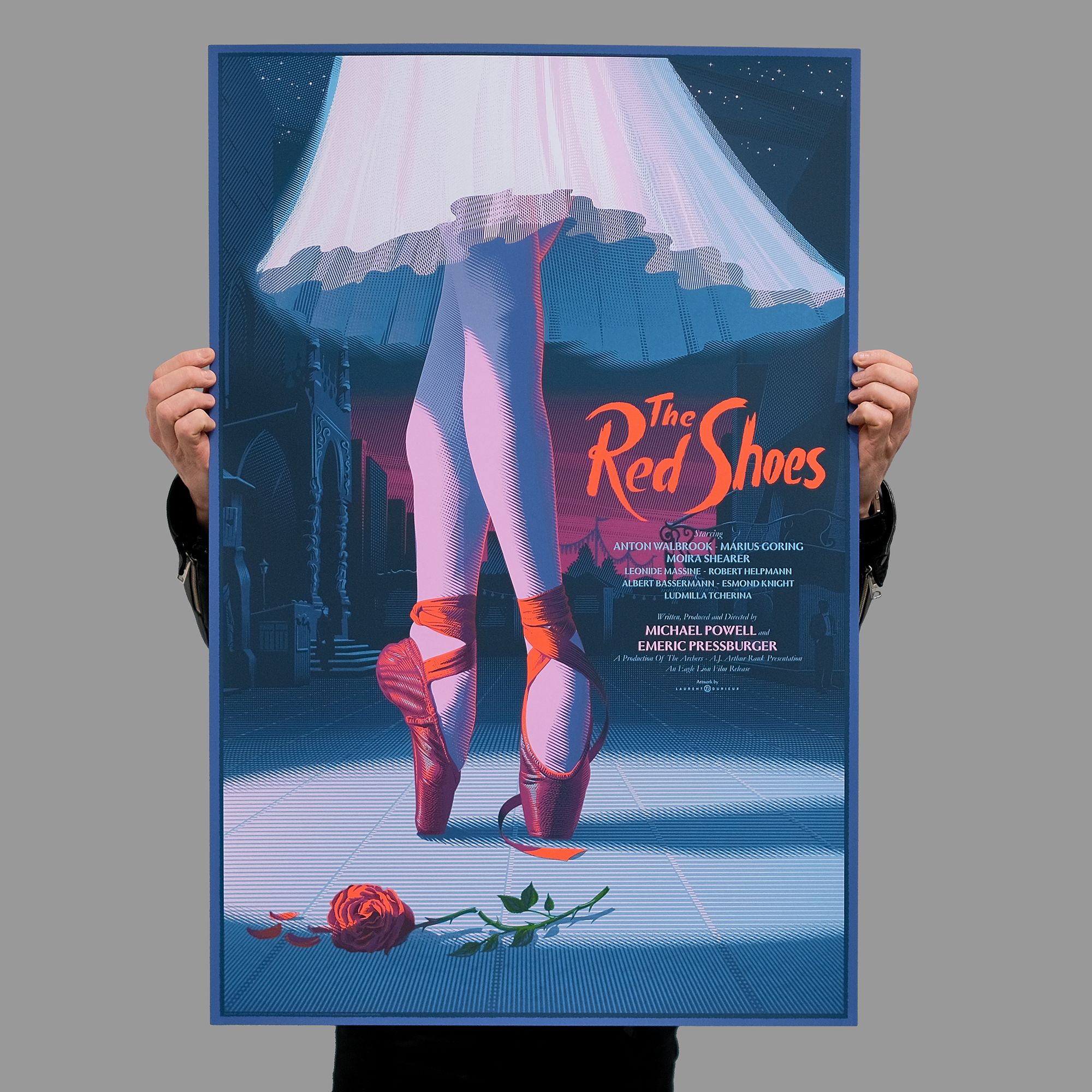
Durieux’s artwork focuses rightly upon the red shoes themselves. Representative, as they are, of an irrepressable spirit, a perpetual motion of creativity, an untiring expression of self. In the background is the grand set design from the debut of the eponymous balet, where the film's mesmeric central dance sequence takes place. To the left is the church, with its almost Gaudi-like minarets, and to the right is the shoe-maker’s shop, crowned with its silhouetted curling rail. Centrally, trails of bunting hang, but in place of the film set’s towering amorphous monolith, we have Victoria Page’s legs, standing on point, the red shoes in spotlit command of everyone’s rapt attention.
It is a fascinating composition. Where, in the film we see the dancer flit through this vast landscape, captivating our eye and leading it across the scene, in the poster we are enthralled by the magnanimity of the dancer’s performance, and therefore its true scale, and by the significance of the red shoes.
Only two other characters populate the scene. Are they Lermontov and Craster, the film’s dominating impresario and predominant composer? Both men are dwarfed by the majesty of the moment, yet despite their patient, almost casual poise, there is a tangible sense of push and pull that their silent presence exerts upon the dancer. With Victoria Page largely out of shot, it is a pressure applied upon the space that exists between art and love — upon the narrow space that exists between life and death.
The use of colour in Duriex’s pair of posters is as keen a feature as in the film itself. In the variant edition especially, where the artist has employed a strong turquoise theme, capturing, as the gallery points out, “the film’s unmistakeable 1940’s technicolour, which cinematographer Jack Cardiff achieved with spectacular effect.” In this respect, the posters are not only a striking nod to the emotional themes of the film, but to its technically vivid brilliance, too.
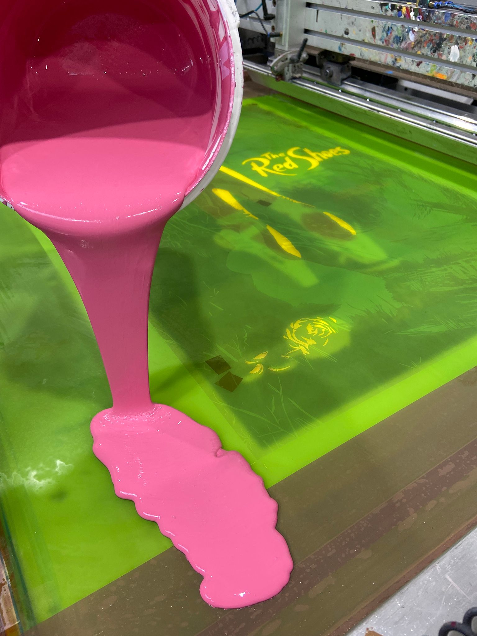
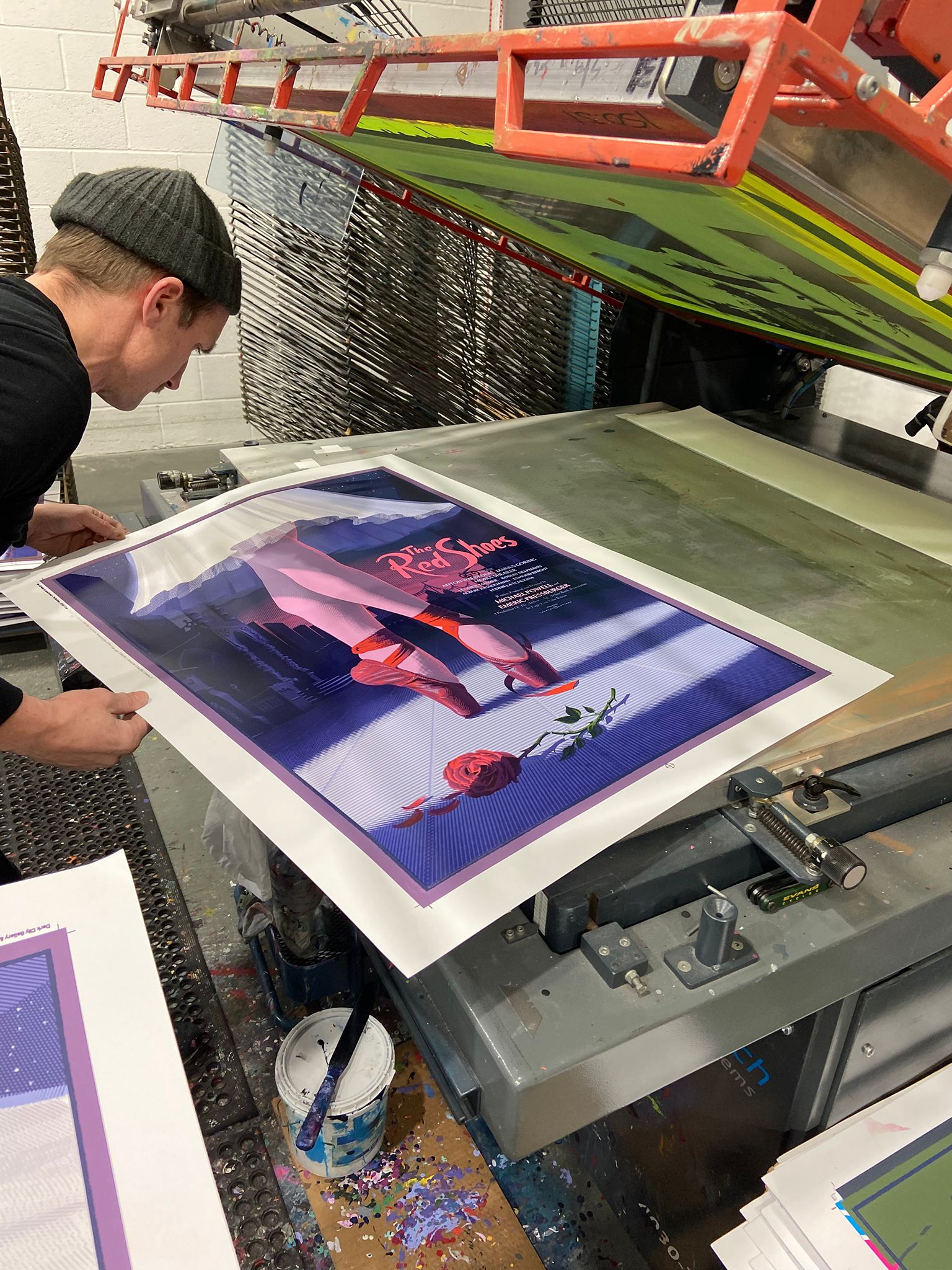
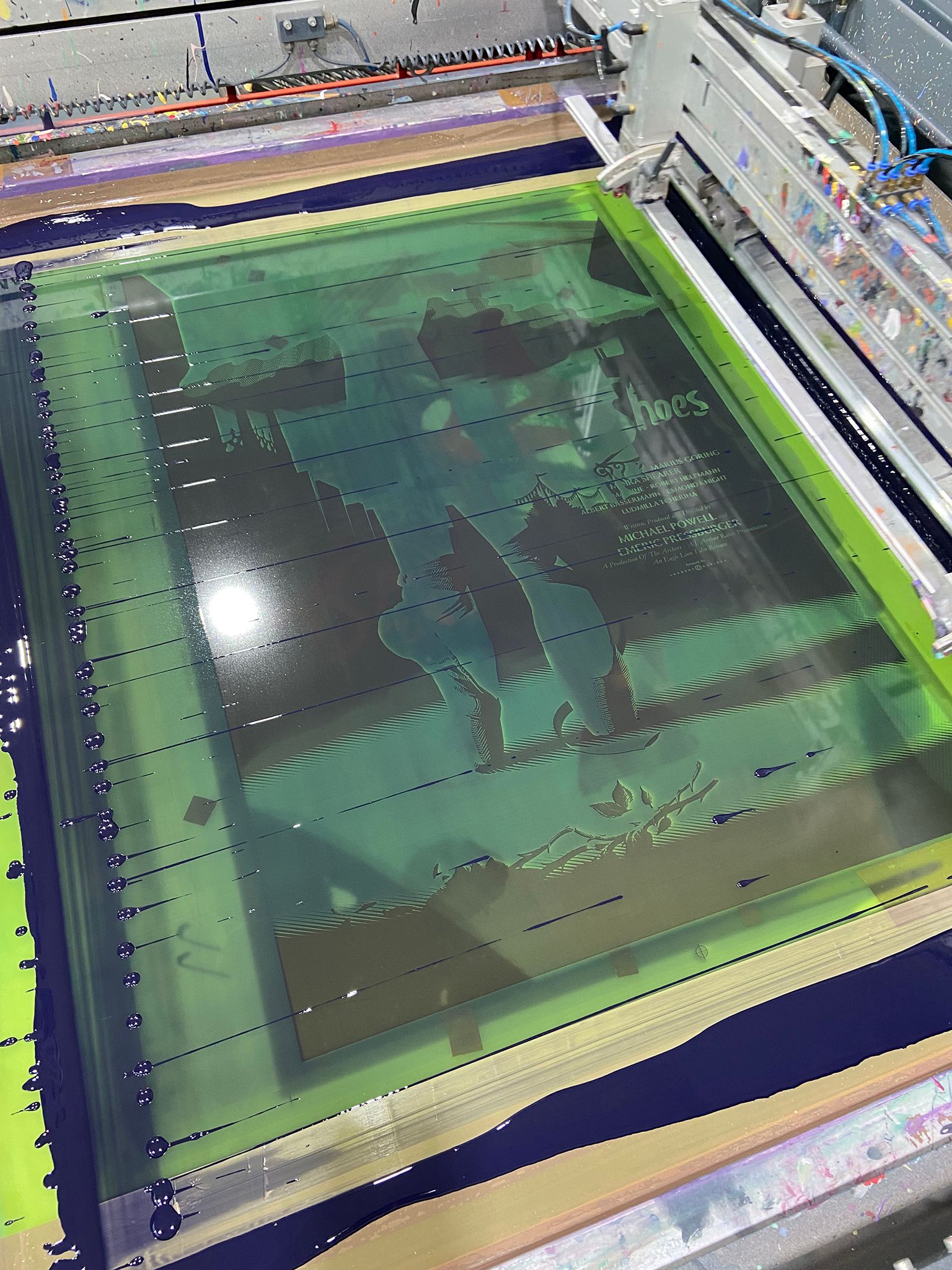
Both the regular and variant editions share the same thirteen screens, though have largely differing colour palettes. Twelve of the thirteen colours are solid spots, but the posters really come to life with the layering of the crucial thirteenth colour, which is a highly attenuated translucent ‘shadow’ layer. In many ways, this is the most adept part of the artwork creation and the most challenging part of the screenprint process, as the translucent shadow needs to achieve a significant number of colouring and darkening effects, all without compromising the nuanced integrity of the fantastic illustration beneath.
Commonly the final layer of a screenprint will be the one that completes the image, but rarely is it quite so make or break to the success of the print.

With Dark City Gallery’s realisation of The Red Shoes, we’ve been provided the first opportunity to screenprint the work of Laurent Durieux. Naturally great fans of the artist’s delectable illustrations, it has been a privilege to navigate the process of finalising art separations, producing giclée proofs, and producing the final screenprint editions, all here in the White Duck Editions studio.
All in all, it has been a thoroughly absorbing and stimulating screenprint edition to work on, and we’d like to extend a big thank you to Dark City Gallery for trusting us with this one. From start to finish, it has truly been a fantastic project.
We highly recommend visiting Laurent Durieux and Dark City Gallery. They are both indispensable figures in the alternative film poster scene, and well worth getting to know.
Edition Details:
Poster: The Red Shoes by Laurent Duriex
Size: 24”x36”
Colours: 13
Paper: 300gsm Gmund Bauhaus
Edition: Regular 200+AP’s / Variant 95+AP’s
Printed with love at White Duck Editions

